
WE ARE AVAILABLE FOR SEPTEMBER PROJECTS


Giftya
Digital Gift Cards
Sole product designer for GiftYa's consumer mobile app and marketing site, architecting the
gift card platform's entire send-to-redeem journey across web and native.



The Challenge
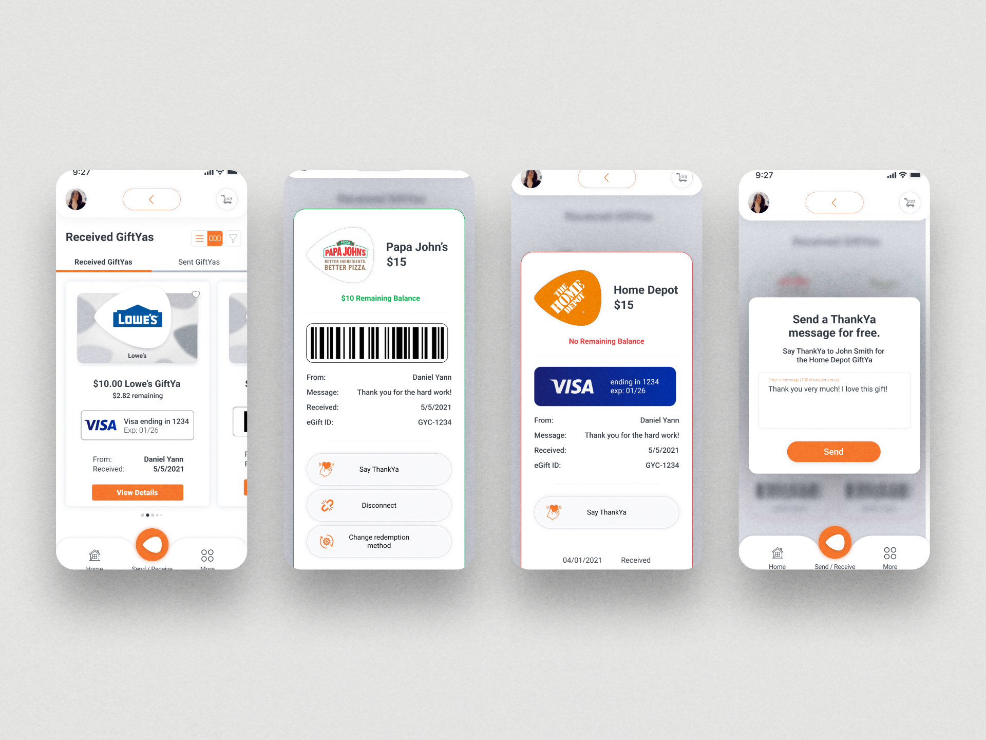
A gift card sounds simple until you account for every way it can actually be received. The merchant might be signed up with GiftYa or might not. The recipient might have a card on file or might not. They might want to use it as a gift card in-store, convert it to spendable money on their own Visa or Mastercard, or exchange it for a completely different merchant. Each of those is a different technical and business path. The job was making all of that complexity disappear behind one simple moment: someone gets a text, taps a link, and has their gift.
User Experience Focus
The entire product hinged on a single UX principle: the recipient should never have to understand how GiftYa works in order to use it. That meant every branching scenario, signed merchant or unsigned, card on file or not, Plaid bank verification or direct Visa connection, had to resolve into the same calm, linear experience from the user's perspective. I mapped every path through the product as its own complete flow before touching visual design, because getting the logic wrong anywhere in that architecture meant a real person couldn't access money that was already theirs.
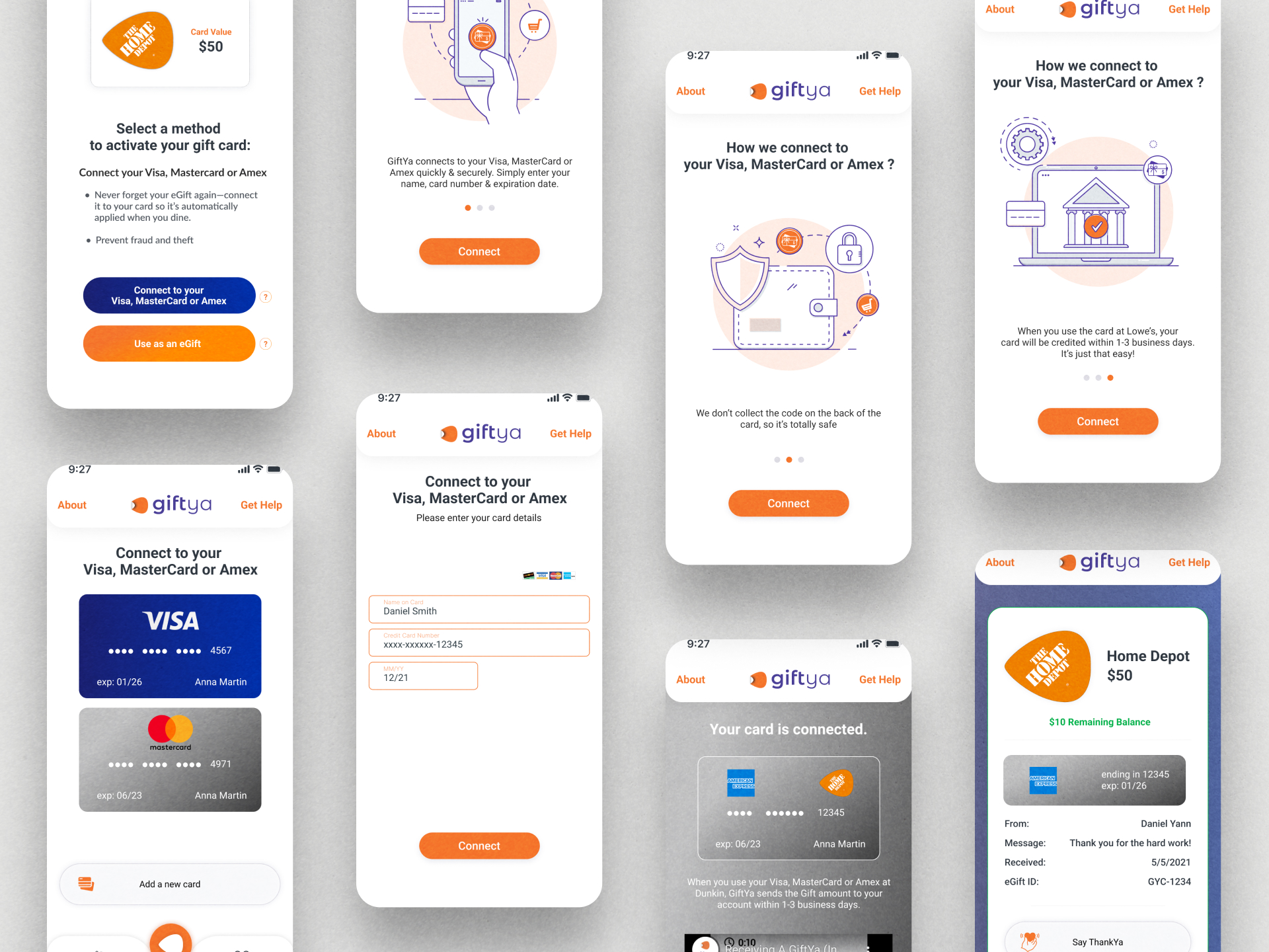
Project research
Working directly with the CEO and product team, I conducted deep discovery into every edge case the product had to handle. Recipient receives a gift from a signed merchant but has no card connected. Recipient wants to swap to a different merchant entirely. Recipient's bank isn't directly supported and requires Plaid verification. Each scenario required its own flow, its own error states, its own recovery paths. The research phase wasn't about user interviews in the traditional sense. It was about exhaustively mapping the business logic so the design could absorb it invisibly.
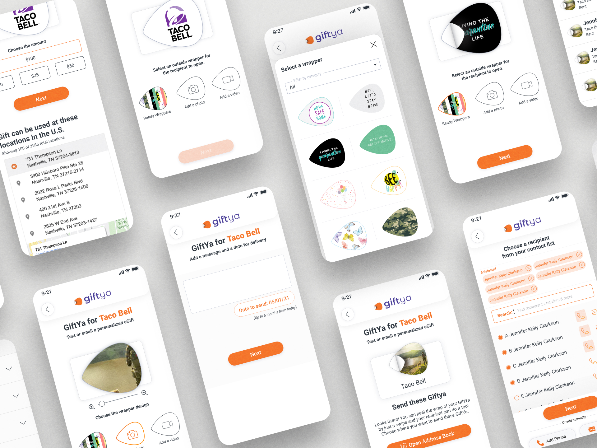
Project result
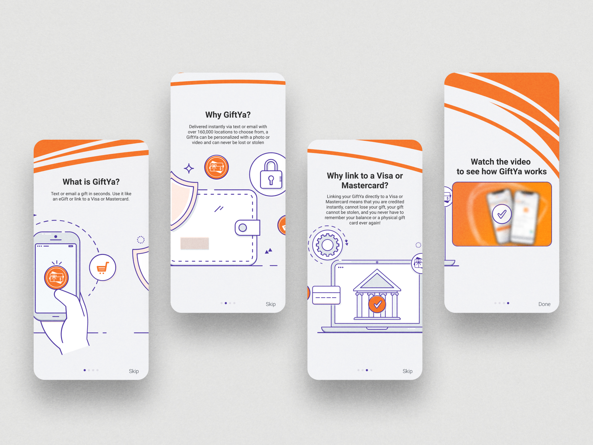
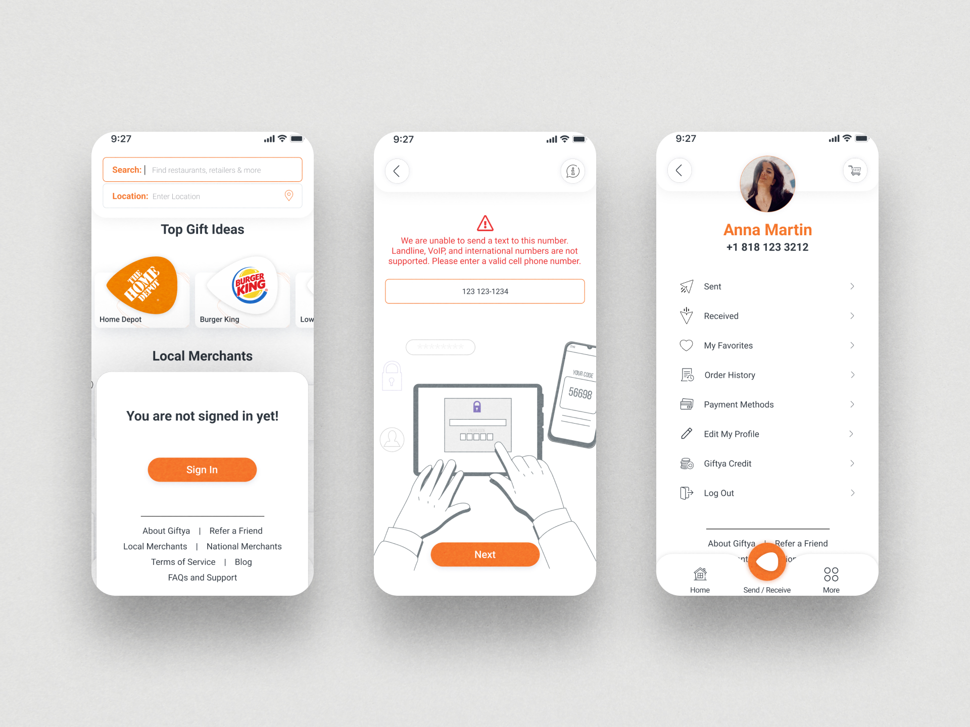
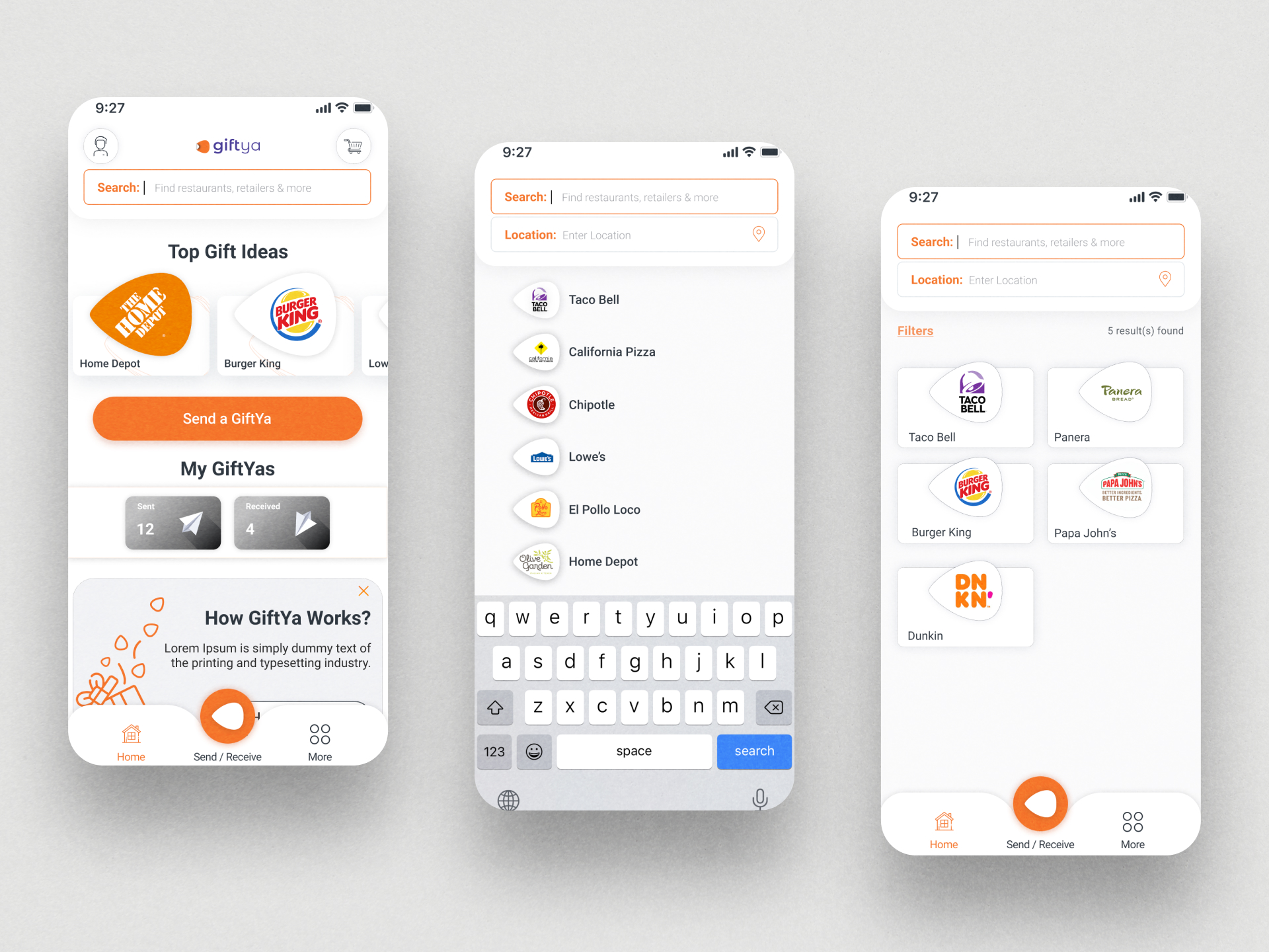
A consumer mobile app and marketing site spanning hundreds of screens: onboarding, home and search, account management, recipient personalization, cart and checkout, and four distinct card activation architectures. I set the visual direction and design system from scratch, executing the majority of screens personally before bringing junior designers in at the final stretch to build out remaining screens against the established system. The finished product takes one of the more complicated financial transactions a consumer app can handle and makes it feel like sending a text message.
Project
Next Project


LET'S BUILD SOMETHING GREAT




 HOUSTON BASED
NATIONALLY PROVEN
HOUSTON BASED
NATIONALLY PROVEN