WE ARE AVAILABLE FOR JULY PROJECTS

CDC Immunization
Platform
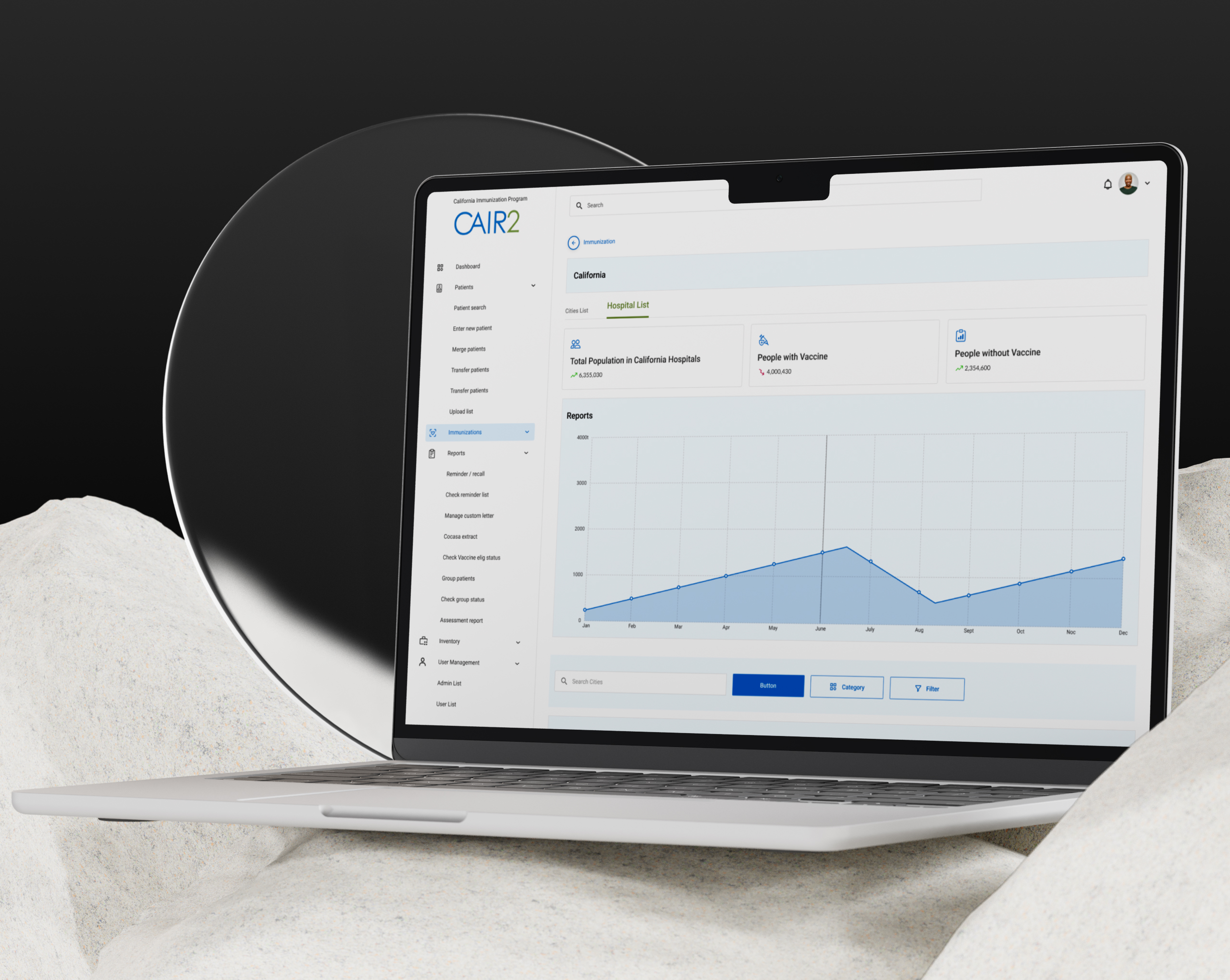
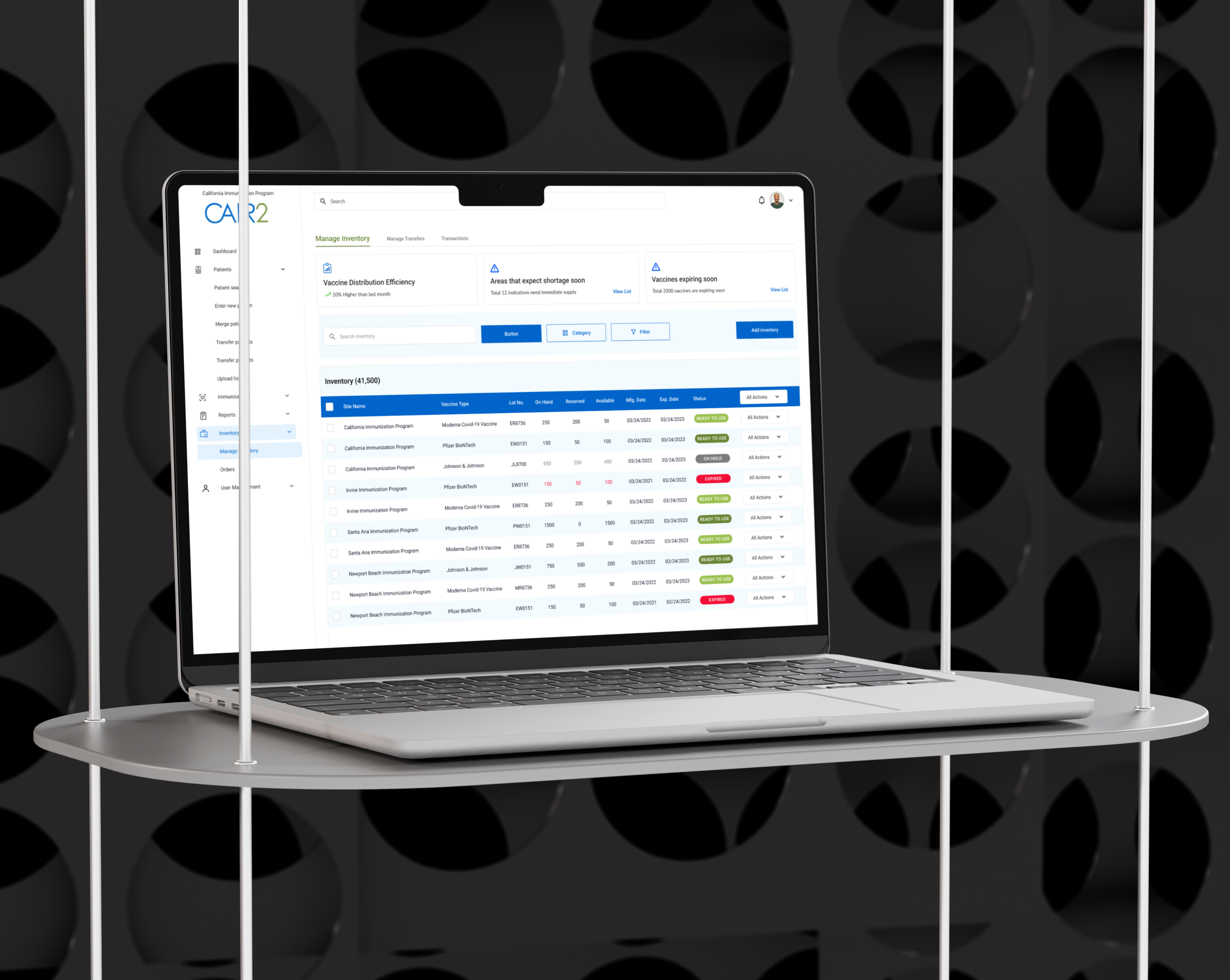
A Material Design dashboard built for the U.S. Centers for Disease Control and Prevention.
We translated complex public health data into a clean, accessible interface
that makes critical information easier to understand and act on.


On this engagement, I made the strategic decision to adopt Google's Material Design system rather than a custom design language, ensuring developers across different state jurisdictions could build from a shared, consistent component library. I also led weeks of user research, including interviews and surveys, across multiple state health agencies to inform the platform's design direction.
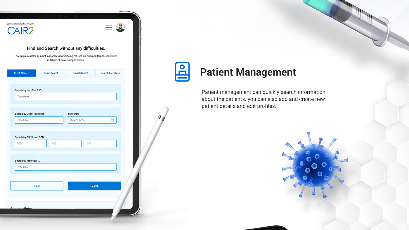
The CDC needed a way to present complex immunization data clearly to both internal teams and the public. Our goal was to make that data feel approachable, not overwhelming.
This project reinforced how much UX strategy matters in high-stakes environments. When the data is sensitive and the audience is broad, clarity isn't a nice-to-have, it's the entire job. The dashboard delivered a cleaner, more navigable experience that made critical public health information genuinely accessible.
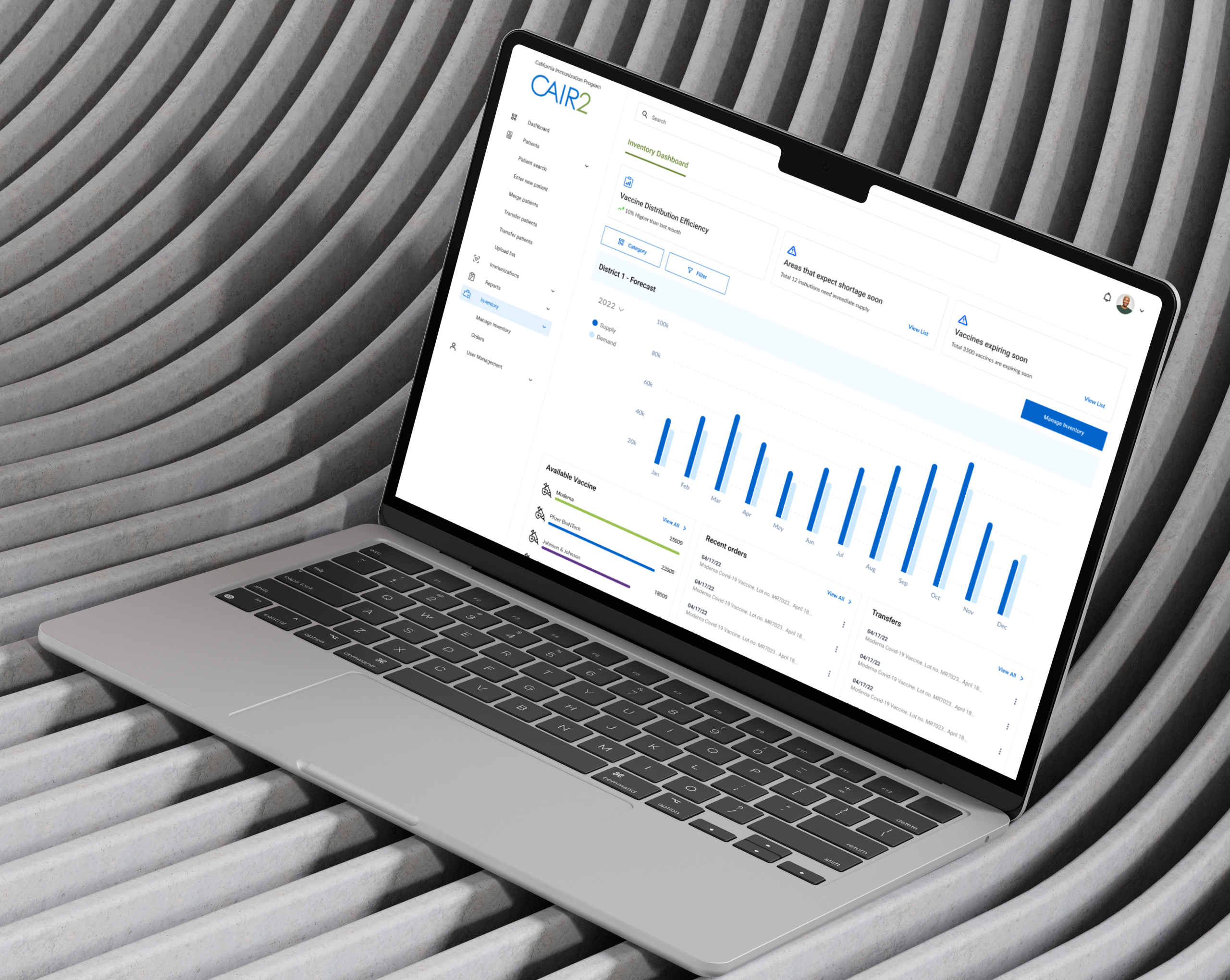
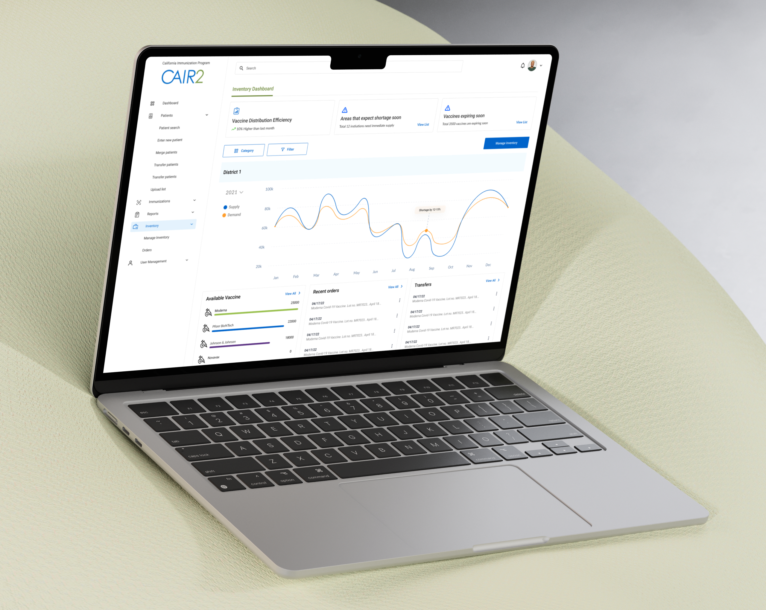
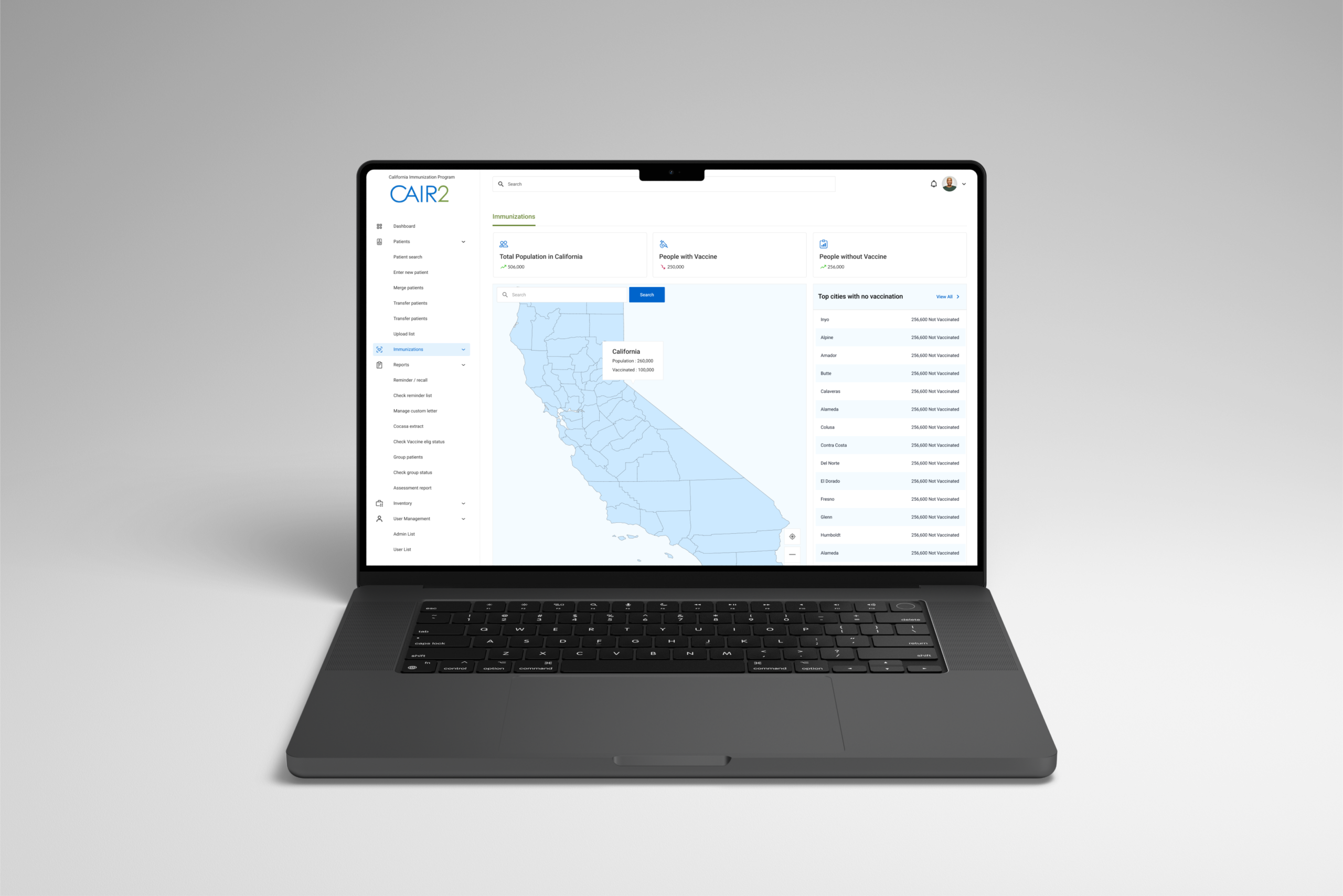
User experience focus
One of the core challenges was presenting dense health data without losing the people who needed it most.
Government dashboards often prioritize data completeness over usability and users pay the price. We focused on visual hierarchy, clear labeling, and intuitive navigation to ensure that whether you were a public health official or a first-time visitor, the information made sense immediately.
Project research
Talking directly to users across different states and agencies revealed a wide range of needs, technical environments, and levels of data literacy. That cross-jurisdictional research was critical. What worked for one jurisdiction didn't always work for another. The insights shaped every design decision that followed and gave the team a shared understanding of the real problem before any solutions were proposed.
Stakeholder interviews and surveys across jurisdictions gave us a research foundation that a purely desk-based approach never could have. The findings were used to build a shared design framework that could flex across different agency needs without losing consistency, giving the development team clear, evidence-based direction from day one.
Project result
The final dashboard brought structure and clarity to data that previously required significant effort to interpret.
By applying Material Design principles and a user-first information architecture, we delivered an interface that made public health data more accessible and easier to act on. The result was a cleaner, more confident product that served both internal CDC teams and the broader public audience it was built for.
Project
Next Project

LET'S BUILD SOMETHING GREAT

 HOUSTON BASED
NATIONALLY PROVEN
HOUSTON BASED
NATIONALLY PROVEN