
WE ARE AVAILABLE FOR SEPTEMBER PROJECTS


HŌM
UX and UI design for HŌM Connect, the consumer-facing mobile and web app at the center of PropCents' homeowner
intelligence platform. We designed the entire app experience, including complete light and dark mode
interfaces, for a product built to keep lenders, servicers, and brokerages connected to homeowners long after closing.



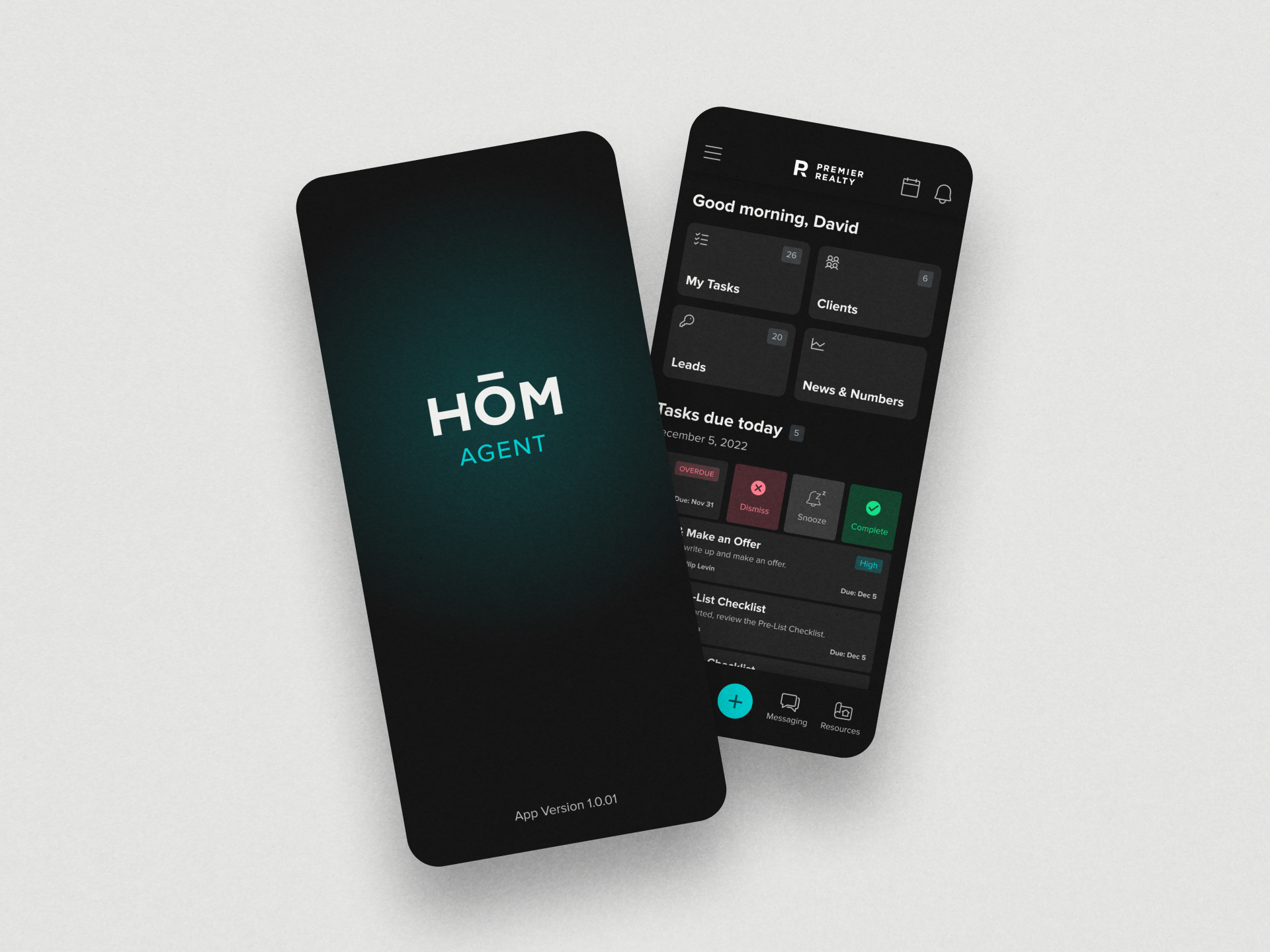
The challenge was designing an app homeowners would actually want to open, not just another portal tied to a mortgage they've already closed.
Most homeowner-facing tools only show up when something is wrong, a payment reminder, a renewal notice. HŌM Connect needed to feel like something homeowners returned to on their own, while still surfacing the signals lenders, servicers, and brokerages depend on.
User experience focus
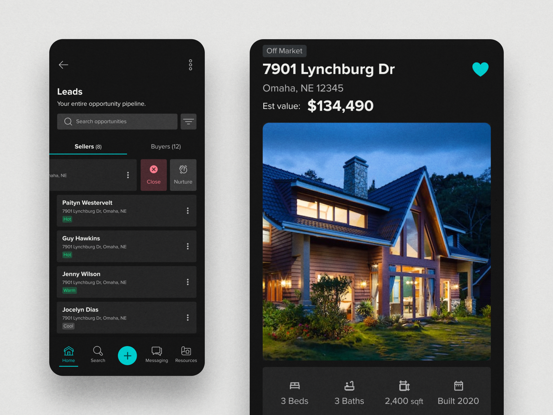
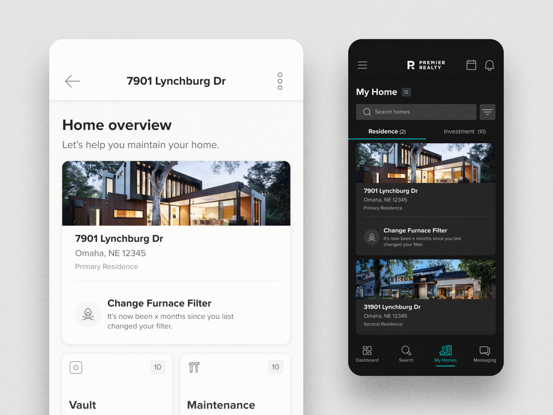
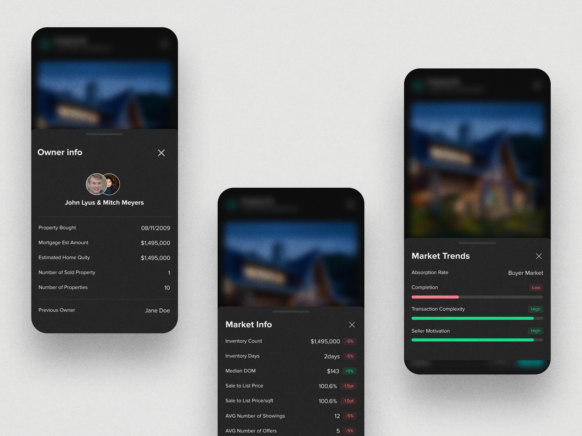
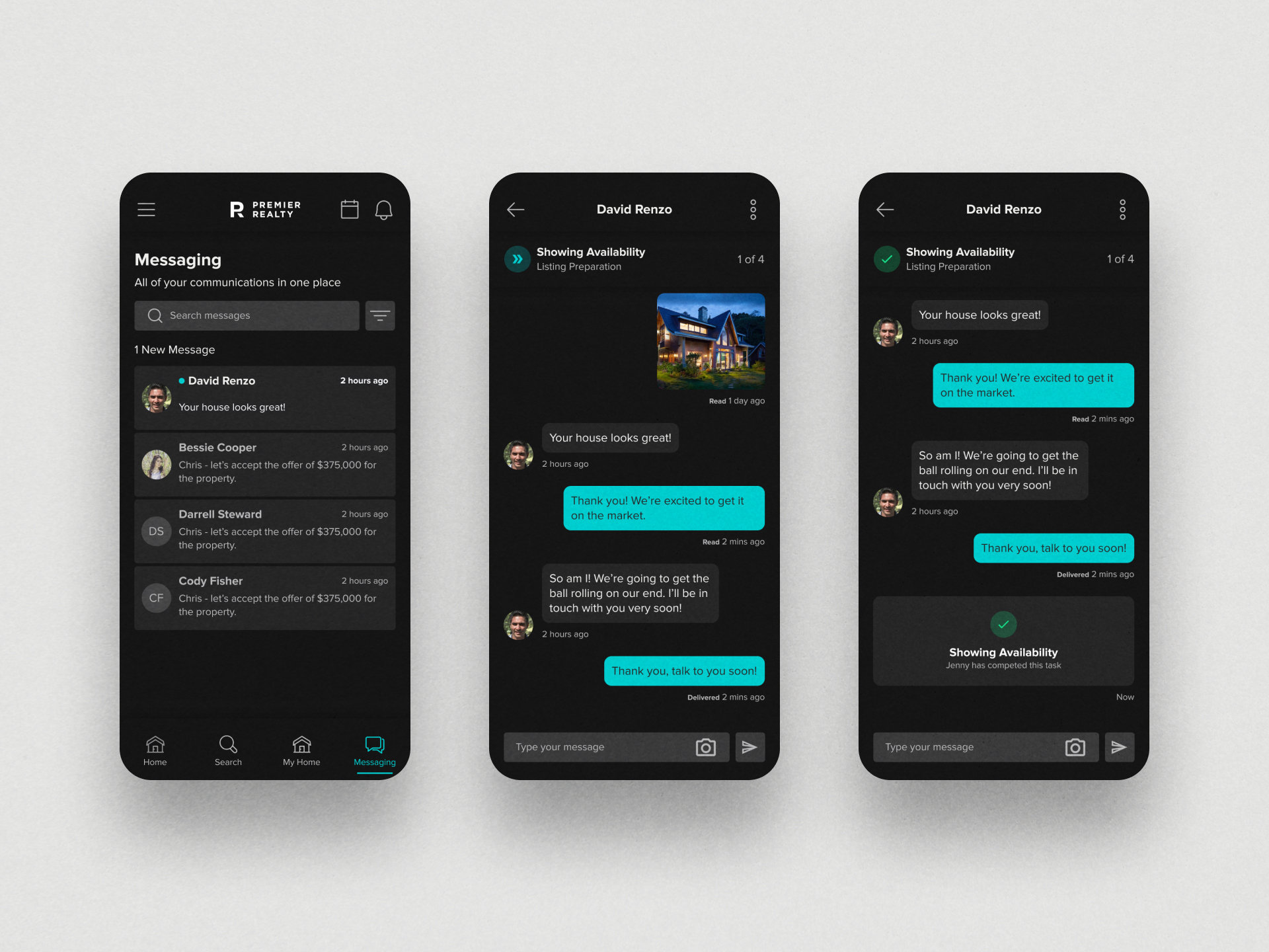
The core challenge was building a consumer-grade experience flexible enough to carry different brands while staying visually cohesive in both light and dark mode.
As a client-branded platform, HŌM Connect needed to adapt to different partners without losing its identity. Designing full light and dark mode coverage across every screen meant every component, color, and interaction had to hold up in two distinct visual environments from day one, not as an afterthought.
Project research
We looked at what makes homeowners re-engage with an app after the transaction that brought them there is already finished.
The research focus was on lifecycle engagement, what brings a homeowner back to an app between major life events like buying, selling, or refinancing. That informed how we structured navigation, notifications, and the overall feel of the app to support ongoing use rather than one-time utility.
Project result
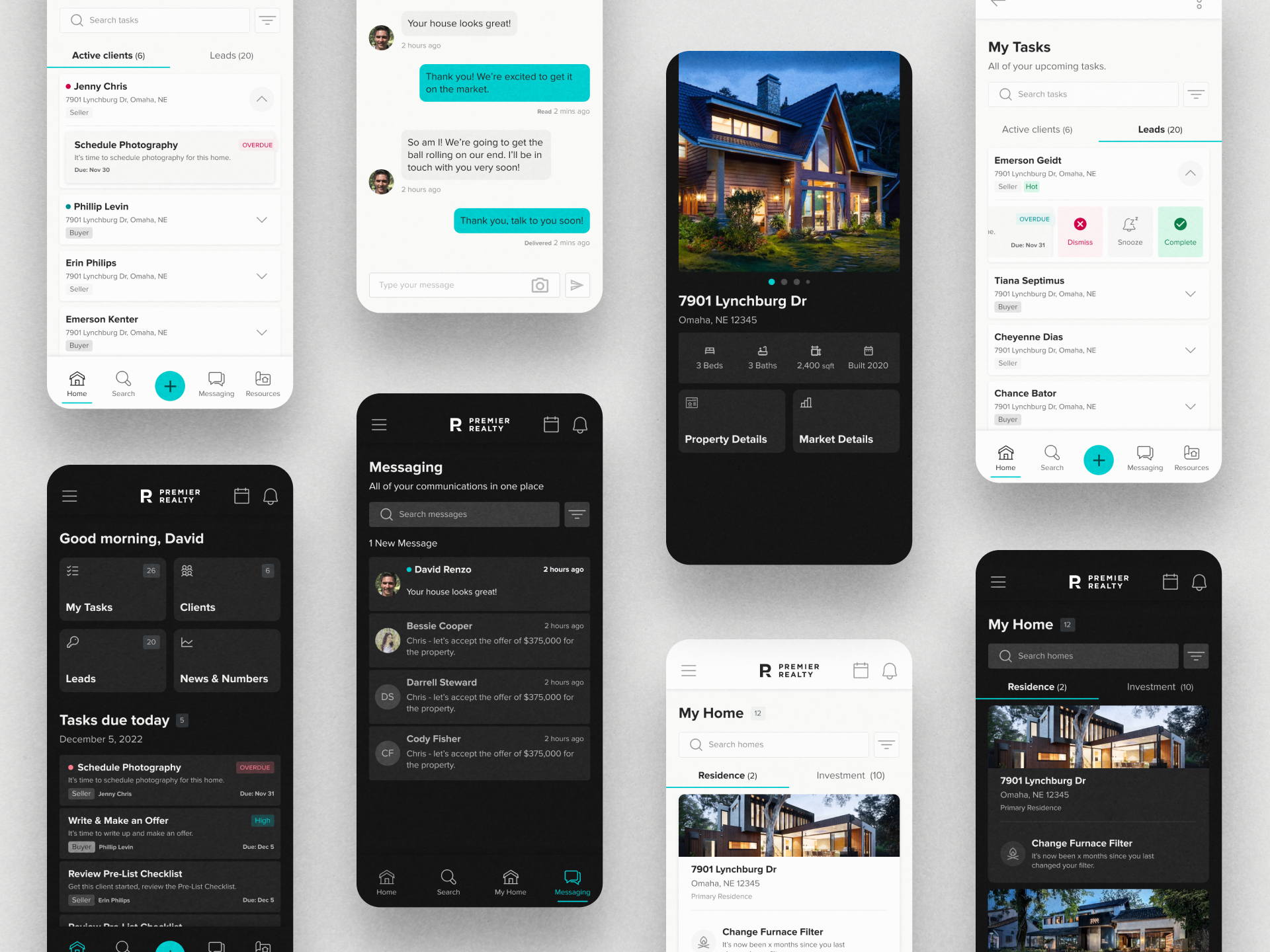
We designed the complete HŌM Connect app, every screen, in both light and dark mode, for web and mobile.
The result is a consumer-first homeowner app that feels like something people want to use, while quietly powering the engagement signals that lenders, servicers, and brokerages rely on. Full light and dark mode support was built in from the start, giving partners a polished, branded experience regardless of how their users prefer to view it.
Project
Next Project

LET'S BUILD SOMETHING GREAT



 HOUSTON BASED
NATIONALLY PROVEN
HOUSTON BASED
NATIONALLY PROVEN